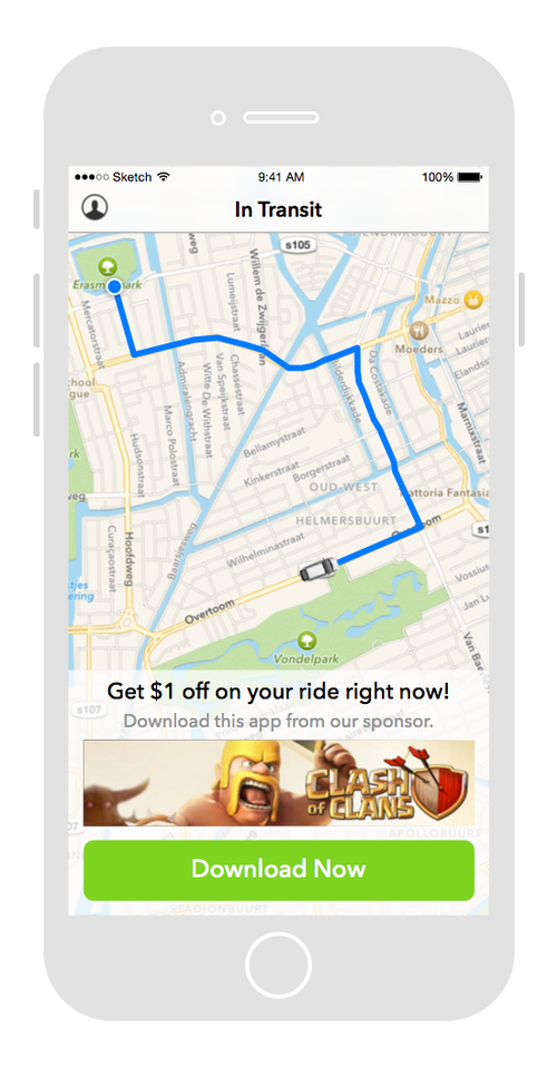
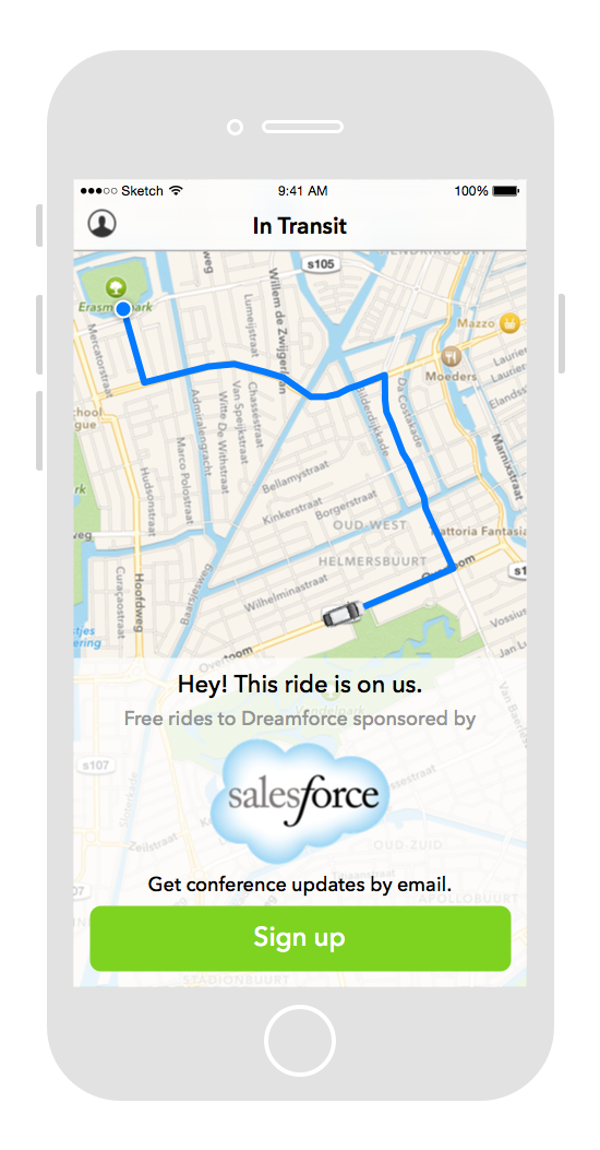
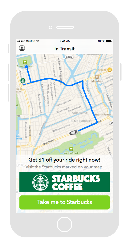
The Customer
Basically, ridesharing works as a 2-sided marketplace. There are the Drivers and the Riders. Riders need to get from Point A to Point B. Drivers take riders where they need to go. Uber needs to quickly and efficiently match a Driver with a Rider to create the transaction.
Both groups are effectively customers. Both groups get paid for each ride, and the product needs to satisfy the different needs of both.
There is definitely more to it than this simplistic overview, but since this project is not an in-depth redesign of the whole product and just a feature concept, our customer research also didn't need to be as rigorous.
Problem Discovery
How might we enable free rides in Uber (or for that matter, any other ride sharing service)?
As a concept, it was an interesting idea to explore, not just for Uber, but generally for all ridesharing services. They can get quite expensive at times (buying time and convenience is expensive!) and leveraging that as a way to subsidize rides through advertising is a real tangible business opportunity.
The Concept
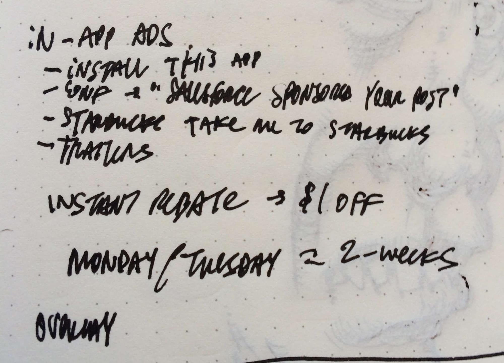
-
I tend to start with writing and sketching.
The first thing to do of course was to sit down and discuss what he had in mind. At the outset of any project, you need to know some fundamental things to help get the creative juices flowing. As part of this is also trying to gather some basic requirements. I mainly try to get enough info to get started and help focus the brainstorming activities.
The basic idea was that ridesharing services (like Uber) could offer free rides by sponsoring someone’s ride and show advertising in the app. After meeting with Andrew, I went right into brainstorming and sketching on my own. Waiting too long to generate ideas may mean that important contextual information gets forgotten. So it’s best to brainstorm ideas when everything is still fresh in your mind. When sketching I always start with rough ideas and concepts, and move to more specific things later on.

Of course not every idea makes it from brainstorming to mockups, and it’s better to focus and zero in on the right concepts. So I decided to focus on simplicity to help design something appropriate for ads on mobile devices. Furthermore, visually, the ads shouldn’t appear as something different. They should look like they’re part of the app, designed with right intent.
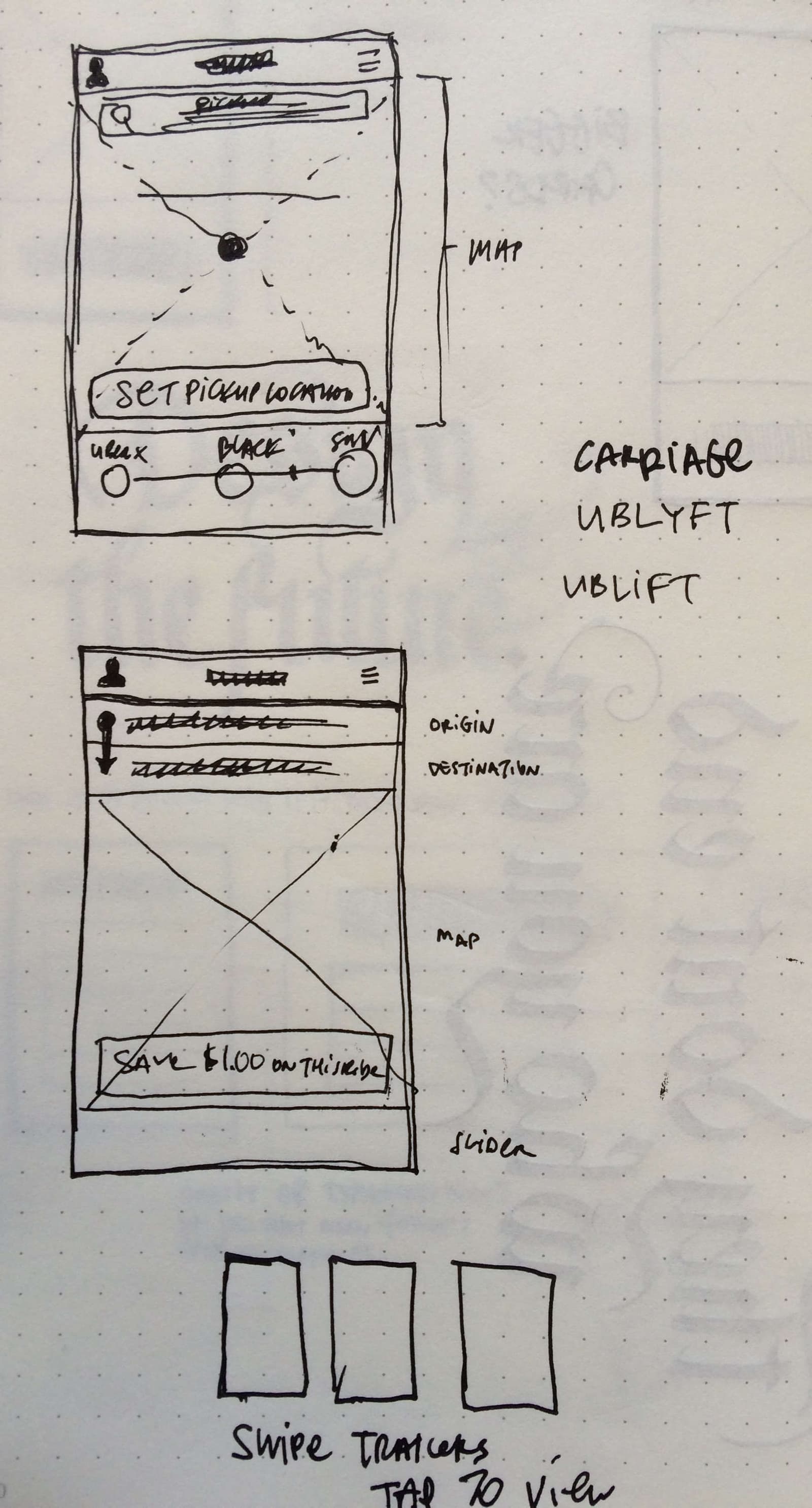
Also, the more I worked on the visual design, it became clear how I could use consistency to help focus the interface on the right things. The visual design went through a few iterations. I sent earlier versions to Andrew for review, and I just kept working and iterating on it till things got more simple and straightforward.
Visual Design Concepts
After sketching, I pretty much just jumped right in to mockups. This was primarily just a concept for Andrew's blog, so not much more needed to be done to make it an actual product...
The Result
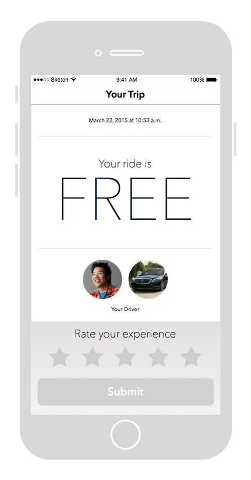
It was really great getting to work with Andrew on developing this concept, and creating some visual aids for what he was writing about. The blog post went out on schedule and I gained some additional Twitter followers (hey, social currency is better than no currency… :P). While I don’t recommend doing unpaid work in general, when someone you admire asks is interested in working together, it’s a good idea to find ways to work with them! I even got a shout out in the blog post!
